bout the Designer
Did you ever wonder why some homes feel so inviting and comfortable? The answer is that layout, design elements, colors, textures, and dimensions must all work together. If one part of the formula is off, rooms may go unused or may subconsciously be avoided. Unfortunately, not all architects and designers understand these more esoteric needs of human nature.
Lin Moty has an uncanny knack for creating balanced layouts and color palettes that comfort the soul and delight the eye. Because of this unique skill, Lin should be the first stop in planning a new home design or attempting a remodel. And she can pull together the team that is needed for a successful construction or remodel project.
Her more than twenty years of design projects, from cozy to stunning, attest to her ability to meet the needs of clients who want the best. Proficient in 3D layout, along with a fine arts background, Lin stands as both designer and artist, making sure the architect's structural elements meet the artistic needs of the living spaces and that the added artistic elements enhance the space they occupy. The result is an environment that lives and breathes in harmony with the owner.
onstruction Notes and Observations
Follow the designer through some of the processes involved in creating the perfect space. Notice the level of detail in the architectural 3D renderings and how well they match the construction work in progress and finished product. Lin's attention to the finer points helps the client envision the end result and ensures the project fits the design goals of the owner.
The Manufacturing Boardroom
This boardroom and waiting room are parked right on the manufacturing floor, giving visitors and customers a front-row view of the processes underway.
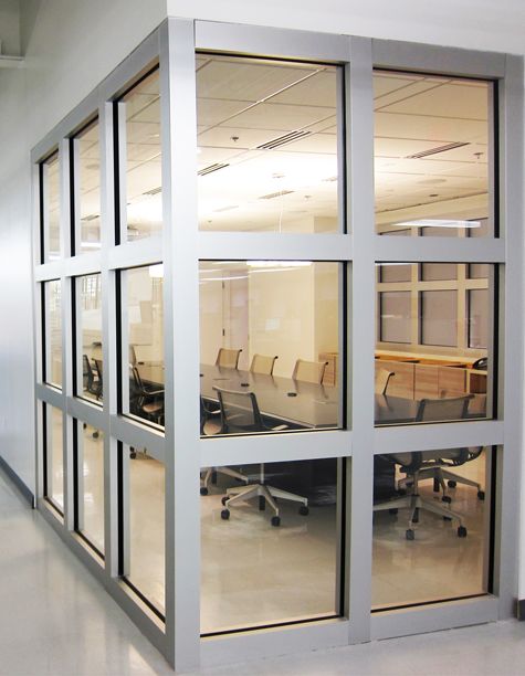
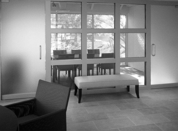
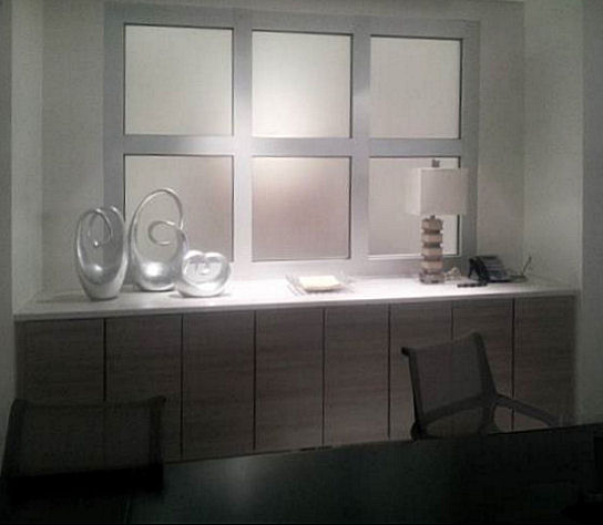
The overall design reflects the industrial setting, while adding a measure of comfort and sophistication to boardroom meetings. The square-grid glass pattern is echoed throughout.
The Little House with Huge potential
Before and After
I don't know about you, but I love before and after pictures. So, here is a before photo of a very tiny, tiny house on the water. It's looking a little depressing at the moment, but it has so much potential.
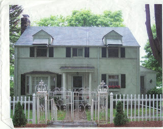
Below is a photo after. The work is still in progress and you can see where they are excavating the footing for a new stone wall to replace the picket fence. We're keeping the iron gates, they're charming.
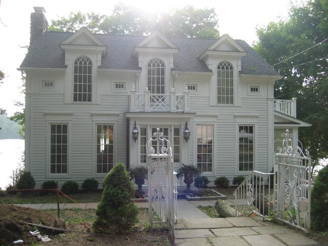
The house is actually a story-and-a-half, but is redesigned to look more like two stories by elongating the windows on the first floor and placing very tall windows that reach into the dormers on the second. It has a grandness even though it is quite small.
Sometimes it's the little things ...
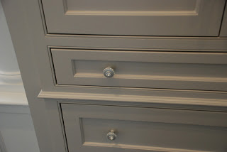
Sometimes it the little things that make the biggest difference — a piece of molding here, a beautiful knob there. This is part of a pantry cabinet, with 2 deep drawers, one shallow drawer and lots and lots of upper storage. The knobs have small crystals around the outer edges and one large in the center.
It's cold outside.
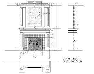
Wouldn't a heartwarming fire be perfect? Our solution is an electric fireplace.
We built one into the Garden Room. They are amazing these days and I've used them in several homes where we want the ambiance, but not necessarily the heat. They're perfect for Dining Rooms and also great for highrise condos, where running a gas line is not a possibility. What's especially wonderful about this one is my client can run the fire in summer when the air conditioning is on. lol
I'll have actual photos of the fireplace soon since it is already complete and painted. It's just waiting for the fireplace surround to go in. I can hardly wait until it has been installed. The floor is a wonderful beige "brick" patterned in herringbone with a border...all adding to the garden-like feel.
Took a quick photo today. The scaffold's in the way, but I think you can get an idea of what it will look like.
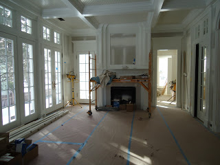
Finished! Draperies will be Next — maybe a linen sheer on thin, metal rods that are antiqued.
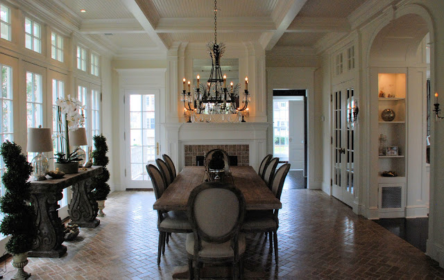
Today it is the Dressing Room
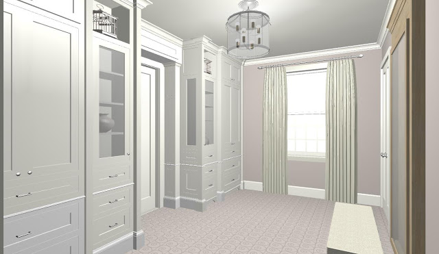
Plans are underway for the Master Closet. There are built-ins on either side of the doorway to the bath. On the opposite side of the room are the closets, his and hers. To give you an idea of the placement, see the plan below.
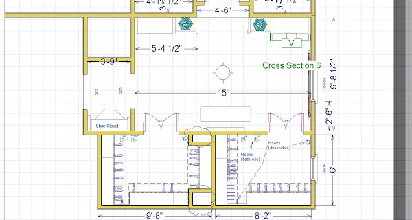
You can see the built-ins and the closet doors just opposite. Believe it or not, he gets the larger closet! He has more clothing than she does. lol
Tucked into the small hallway, just outside the Dressing Room, is a closet for shoe storage, a small bonus for those who don't want to store dirty shoes with clean clothing.
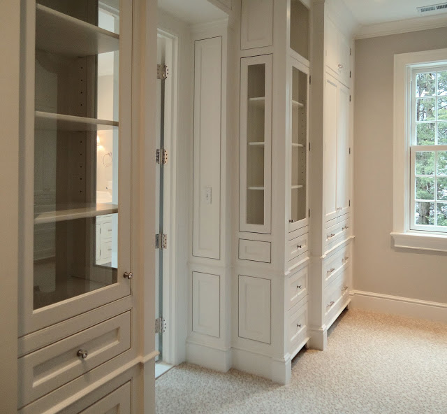
The carpet is nice and skoochie — is that a word? It's a leopard print .. but softly so. The room has a hushed quality when you walk in.
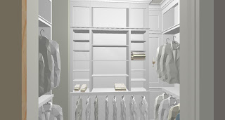
There are two walk-in closets, one for him and one for her. The floors will be wall-to-wall carpet — the only in the entire house. Elsewhere the floors are either wood or stone. But, back to the closet — above is a rendering of his closet (someone needs to iron the shirts).
Time to do the Laundry?
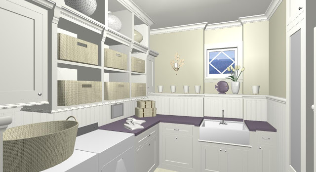
Today it was the Laundry Room. The cabinets are built and templating was done for the countertops. We still haven't decided if we'll be doing natural stone or composite. I think, though, that it will most likely be natural stone.
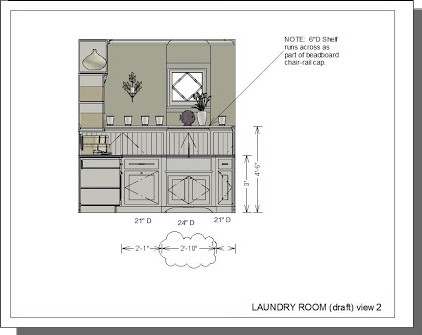
Window elevation
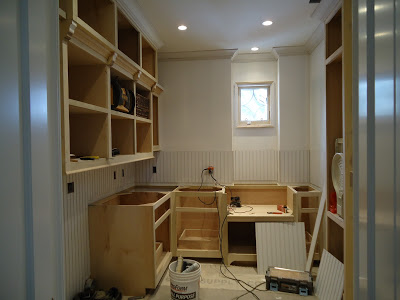
In Progress — looking good!
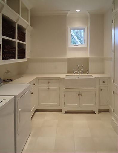
Ready to move in!
onstruction Notes and Observations
When you visit Project Notes, notice the level of detail in the architectural 3D renderings and how well they match the construction work in progress and finished product. Lin's attention to the finer points helps the client envision the end result and ensures the project fits the design goals of the owner.
Credits
Architecture:
- John Smith
- George Washington
- Thomas Jefferson
Photography:
- Annie Liebovitz
- Ansel Adams
Interior Design:
- Lin Moty
- Donato Bramante
- Leonardo da Vinci
Decorating:
- Jane Doe
- Amy Vanderbilt
ontact Lin Moty
- Connecticut
- Telephone: 2 03. 82 6. 72 21
- Email: Send Email